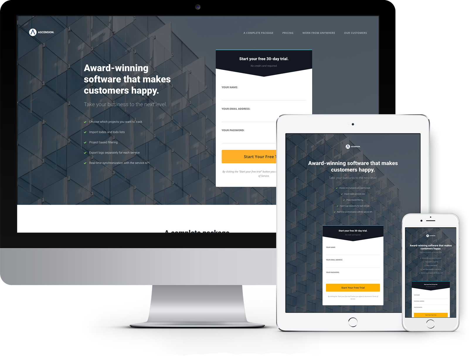
Ascension 1.0 - Template Documentation

Sections and wrappers

The sections and wrappers are used to properly display, separate and layout content in the page.

Working with wrappers

A wrapper is a containing element that's used for centering content in the page and giving it a maximum width. Start a wrapper with a div class .wrapper.

Code Preview
						                            
						                                <div class="wrapper">
						                                    <p>The content goes here.</p>
						                                </div> <!-- end .wrapper -->


The content goes here.

By default, the wrapper has a maximum width of 85% and it's centered on the page. You can change the default behaviour by using helper classes.

Helper classes

Class Description Code & preview
fw Sets the wrapper width to 100%.
						                            
						                                <div class="wrapper fw">
						                                    <p>The content goes here.</p>
						                                </div> <!-- end .wrapper -->


The content goes here.

off-axis Aligns the wrapper to either side of the page, very useful when you want to start the content from the very edge of the page. By default, this aligns the wrapper to the left, but using the extra class of .inverse will align the content to the right edge of the page.
						                            
						                                <div class="wrapper off-axis inverse">
						                                    <div class="grid middle distribute large-media-object">
						                                        <div class="cell md-auto lg-7 media">
						                                            <img src="assets/img/large-image-work-from-anywhere.jpg" alt="Placeholder">
						                                        </div> <!-- end .cell -->
						                                        <div class="cell md-auto lg-4 xlg-3 content">
						                                            <h3 class="heavy">Work from anywhere</h3>
						                                            <p>You can work from your computer, smartphone, tablet or Apple Watch. There are apps available for macOS, Windows, iOS, Android and watchOS.</p>
						                                            
						                                            <ul class="vertical-list with-icon icon-check with-border">
						                                                <li>Web App</li>
						                                                <li>macOS &amp; Windows Apps</li>
						                                                <li>iOS &amp; Android Apps</li>
						                                                <li>watchOS App</li>
						                                                <li>Maximum flexibility</li>
						                                            </ul>
						
						                                            <a href="#top" class="button secondary">Start today</a>
						                                        </div> <!-- end .cell -->
						                                    </div> <!-- end .grid -->
						                                </div> <!-- end .wrapper -->
						                            
						                        
Placeholder

Work from anywhere

You can work from your computer, smartphone, tablet or Apple Watch. There are apps available for macOS, Windows, iOS, Android and watchOS.

  • Web App
  • macOS & Windows Apps
  • iOS & Android Apps
  • watchOS App
  • Maximum flexibility
Start today

Working with sections

Sections have large top and bottom paddings to separate large blocks of content. Use the class of .section to get started.

Code Preview
						                            
						                                <div class="section">
						                                    This is the first section content.
						                                </div> <!-- end .section -->
						
						                                <div class="section">
						                                    This is the second section content.
						                                </div> <!-- end .section -->
						                            
						                        
This is the first section content.
This is the second section content.

Section title

Ascension offers a special class for the section titles. This has various widths depending on the screen size, the text is usually center aligned and has an increased margin bottom.

Code Preview
						                            
						                                <div class="wrapper section">
						                                    <div class="section-title">
						                                        <h2>A complete package.</h2>
						                                        <h4>Supercharge your workflow with Ascension's built-in tools and platform availability.</h4>
						                                    </div> <!-- end .section-title -->
						                                </div> <!-- end .wrapper -->


A complete package.

Supercharge your workflow with Ascension's built-in tools and platform availability.